
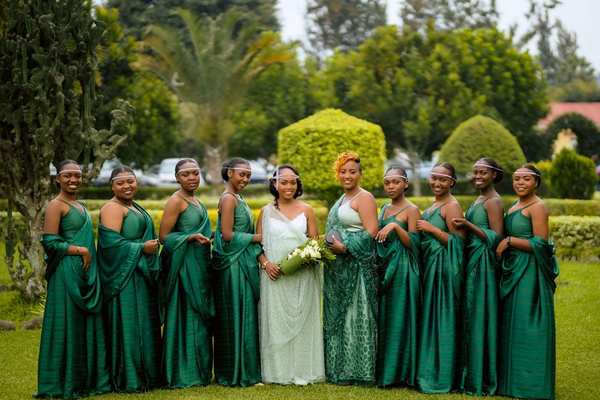
A coordinated bridal party should look intentional in photos without feeling as though everyone was dressed from the same rack. The easiest way to achieve that balance is to think in terms of a color story rather than one exact shade. When dresses, suits, accessories, and flowers share a visual relationship, the group feels cohesive even when individuals wear different tones, fabrics, or silhouettes.
The key is to make a few decisions early: choose an anchor color, define the shades that belong with it, and decide which elements should stay consistent. That gives your bridal party enough direction to shop confidently while leaving room for personal style, skin tone, comfort, and budget.
Start With an Anchor Color, Not a Single Swatch
If you are figuring out how to coordinate bridal party colors, begin with one anchor color that connects to the wider wedding design. It might come from your venue, flowers, stationery, table linens, or simply a color you love. Then build outward instead of requiring every outfit to match it exactly.
For example, if dusty blue is your starting point, your bridal party color scheme could include slate blue, soft denim, muted navy, and blue-grey. These shades create depth while still looking related. In photographs, that often appears more natural than several dresses in a supposedly identical shade that varies between fabrics or brands.
Choose a Color Relationship That Fits Your Wedding
Use Tonal Shades for a Soft Look
A tonal palette uses lighter and darker versions of one color family. Sage, eucalyptus, olive, and deep forest green can work together beautifully. This approach is especially useful when you want different dresses while keeping an obvious visual connection.
Mix Neighboring Colors for More Personality
Colors that sit near each other visually can create a richer palette without looking random. Think blush, rose, mauve, and soft berry, or sand, caramel, rust, and terracotta. This style works particularly well for romantic, garden, autumnal, or bohemian weddings.
Use Neutrals to Balance Stronger Shades
If you want one or two statement colors, balance them with neutrals. Burgundy and rust can feel heavy when used everywhere, but champagne, taupe, or soft beige creates breathing room. Neutrals also make it easier to connect bridesmaids, groomsmen, and family members without putting everyone in the same hue.
Set the Palette Before Everyone Starts Shopping
Too much freedom can make a mixed bridal party look accidental rather than curated. Give attendants a defined bridesmaid color palette before purchases begin. Instead of saying “anything in pink,” provide three or four approved tones and visual references.
A simple digital mood board can include dress examples, fabric swatches, flowers, and suit colors. It helps everyone understand whether you mean warm blush, dusty rose, cool pink, or vivid fuchsia. Retailer color names vary, so images are often more useful than labels.
This planning stage also connects naturally with bridesmaid dress styles, choosing wedding flowers, and coordinating suits with wedding colors. Thinking about those elements together makes the final look feel deliberate rather than pieced together.
Pay Attention to Undertones
One of the most useful rules in wedding color coordination is to watch undertones. Two dresses may both be called “champagne,” but one may lean peach while another appears grey or yellow. Those differences become more obvious when people stand side by side.
Try to keep warm shades with warm shades and cool shades with cool shades. Warm palettes can include cream, peach, terracotta, camel, olive, and warm taupe. Cooler palettes might use icy blue, lavender, blue-grey, charcoal, or silver. The goal is not laboratory-perfect matching; it is simply making sure the shades look like they belong together.
Use Fabric and Texture to Create Variation
Even when everyone wears a similar color, varied fabrics can stop the group from looking too uniform. Chiffon, satin, velvet, crepe, and tulle reflect light differently, creating natural tonal variation.
Shiny fabrics can photograph lighter or brighter than matte fabrics, especially outdoors or with flash. If your palette is subtle, compare swatches in natural daylight. A satin sage dress and a chiffon sage dress may read as different colors in photos, which can either add depth or create an unwanted contrast.
Coordinate the Groomsmen Without Copying the Bridesmaids
Groomsmen do not need ties or pocket squares that exactly match the bridesmaid dresses. A softer connection often looks more polished. If the bridesmaids are wearing terracotta, for example, the groomsmen could wear tan suits with cream shirts and rust-toned boutonnieres instead of terracotta ties.
You can repeat the palette through small details such as floral accents, ribbons, pocket squares, or boutonnieres. This keeps both sides of the bridal party connected while allowing each group to retain its own visual identity.
Use Flowers and Accessories as the Bridge
When outfits vary, flowers are one of the easiest ways to make the bridal party feel unified. Bouquets can repeat several shades from the clothing palette, visually connecting different dresses. Shoes, jewelry, hair accessories, and ties can play the same role.
Choose only one or two shared elements. You might allow different dress colors and silhouettes but keep bouquets consistent, or use the same jewelry metal while letting each person choose shoes. Too many identical details can make the look feel matchy again.
Test the Full Group Before the Wedding Day
Do not judge each outfit separately. Ask attendants to send daylight photos of their full looks, then create a simple collage. Seeing everyone together can reveal an outlier that was not obvious when each dress was viewed alone.
Imagine a palette of dusty rose, mauve, and berry. Five dresses may look balanced, but one bright candy-pink dress could dominate every group photo. Catching that early gives you time to adjust the shade, accessories, or flowers before the wedding.
FAQ
How many colors should a bridal party have?
Three to five related shades are usually manageable. Smaller groups may look best with two or three tones, while larger groups can support more variation. What matters most is that the colors share compatible undertones or clearly connect to the overall wedding palette.
Should bridesmaids wear the exact same color?
No. Matching dresses can look elegant, but related shades, consistent undertones, and a few shared styling details can create a cohesive bridal party while giving each person more flexibility.
Do groomsmen ties need to match bridesmaid dresses?
Not necessarily. Ties can complement the bridesmaid palette rather than duplicate it. Neutral ties, subtle patterns, or floral details often create a more sophisticated connection than exact matching.
How can mismatched bridesmaid dresses look intentional?
Set clear boundaries before anyone buys: define the approved color range, undertone, level of formality, and any fabric preferences. Then review the choices together. A shared bouquet style or accessory detail can finish the look.
Create a Palette That Looks Connected, Not Copied
The strongest bridal party palettes have enough repetition to feel planned and enough variation to feel personal. Choose an anchor color, control undertones, limit the approved shades, and use flowers or accessories to connect the group. With those decisions made thoughtfully, your bridal party can look cohesive, flattering, and beautifully individual.